5 Unmissable Highlights Of Stanley Kubrick: The Exhibition
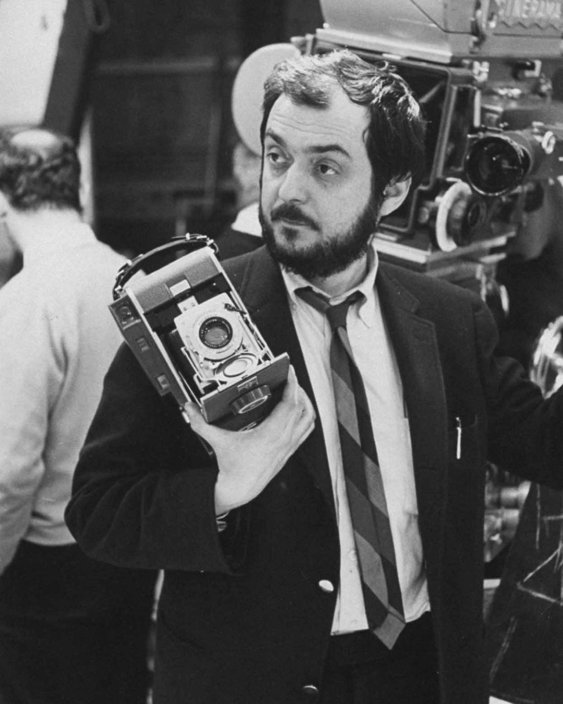
“A director is a kind of idea and taste machine; a movie is a series of creative and technical decisions, and it’s the director’s job to make the right decisions as frequently as possible” – Stanley Kubrick
Nobody could craft a movie better than Stanley Kubrick, and the London Design Museum’s exhibition makes that a case in point. Marking the 20th anniversary of Kubrick’s death, Stanley Kubrick: The Exhibition is a celebration of one of the greatest filmmakers of the 20th century. An impressive showcase of 700-odd objects, including film reels and interview snippets, bring to life Kubrick’s innovative spirit and his fascination with all aspects of design. For cinephiles and aspiring-directors, the exhibition is a rare insight into legendary auteur’s body of work, and his innovative yet obsessive nature to achieve almost perfection in the art of filmmaking.
If you plan to visit Stanley Kubrick: The Exhibition, the incredible attention to detail may leave you feeling overwhelmed, luckily our rundown of the five exhibition highlights is here to help.

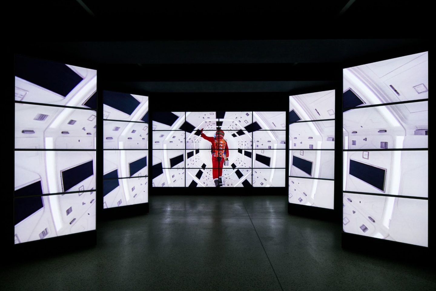
One point perspective corridor at the entrance to the exhibition. Image by Ed Reeve.
The ‘one-point perspective’ corridor
“When entering the exhibition you’re welcomed by a bank of video screens showing clips of Kubrick’s genre-defining films. The angled screens celebrate Kubrick’s signature use of a symmetrical one-point perspective, while the legendary theme song from 2001: A Space Odyssey invites you down the corridor into the mind of one the greatest film directors of all time” Graphic Designer, Chloe
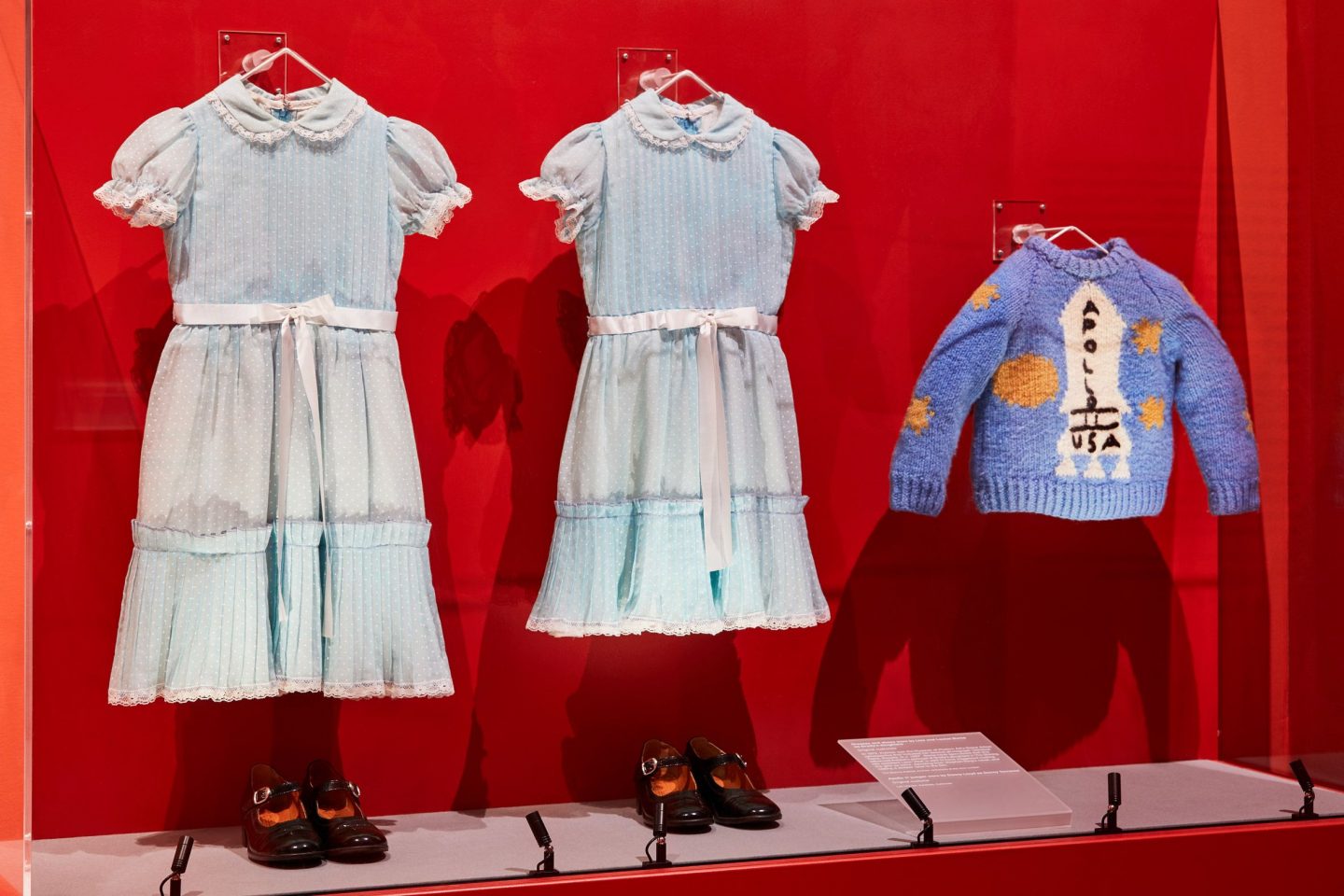
Grady sisters’ costumes and Danny’s jumper, original costumes from The Shining. Image by Ed Reeve.
The props from The Shining
“I love everything about The Shining and always have; the pathos, the sound, the rising tension and of course the inimitable Shelley Duvall – so it’s amazing to see some of the iconic props in the flesh. From Danny Torrence’s homespun Apollo 11 sweater, to the eerie twin’s matching blue dresses, a diorama of The Overlook maze and Jack’s typewriter where he penned the immortal sentence: All work and no play makes Jack a dull boy, it’s all there to pore and obsess over and makes you realise how detailed Kubrick’s productions really are.” Brand & Content Editor, Charlotte
“One of the things that horror stories can do is show us the archetypes of the unconscious; we can see the dark side without having to confront it directly” - Stanley Kubrick
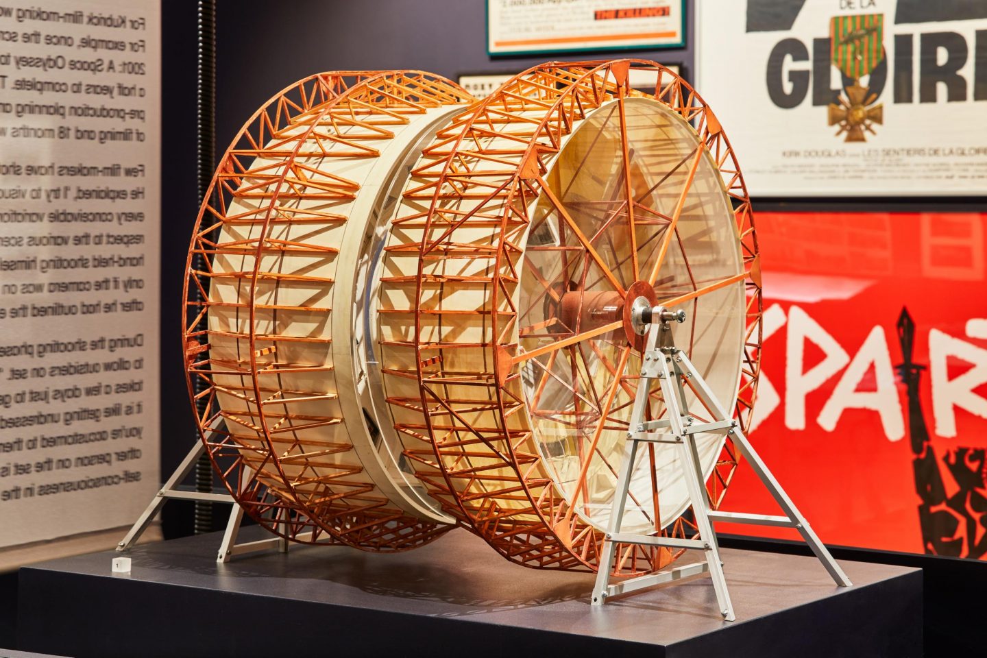
Centrifuge model from 2001: A Space Odyssey. Image by Ed Reeve.
The special effects of 2001: A Space Odyssey
“The miniature mockup of the groundbreaking Centrifuge-set that Kubrick had developed for 2001: A Space Odyssey offers a rare insight into Kubrick’s incredibly detailed nature. The 12m-high hamster wheel that allowed the upside down scenes to be shot, not only revolutionised special effects but conveyed Kubrick’s obsessive yet unique ability to create true-to-life experiences for the big screen.” Brand Copywriter, Helena

Centrifuge model from 2001: A Space Odyssey. Image by Ed Reeve.
“In a dozen or so films, [Kubrick] demonstrates his remarkably adventurous versatility, endlessly inspiring us to realise that you can be widely varied in form and content, without ever losing your vision and style, or descending into mere eclecticism.” - Film Director, Mike Leigh
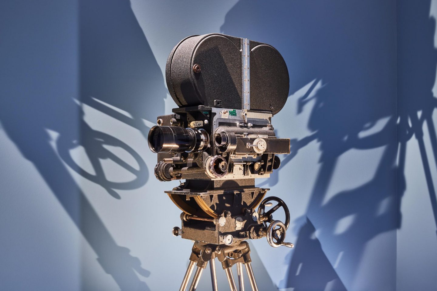
BNC Mitchell camera with the Zeiss lens developed for NASA. Used to film Barry Lyndon by candlelight. Image by Ed Reeve.
The go-to film cameras Kubrick loved
“The Design Museum’s tribute to Kubrick is not short of material that depicts the auteur’s unique creative process of film making. As someone who is a bit of a camera enthusiast, seeing Kubrick’s go-to film cameras on display was a once in a lifetime opportunity. The Arriflex 35IIC handheld camera was one of the director’s favourites, used on A Clockwork Orange and Eyes Wide Shut, but could only withstand two minutes of shooting time. Then there is the use of the Steadicam, a type of camera stabilizer allowing for smooth film shots; remember how eerie it was to watch Danny riding his tricycle around the hotel In The Shining? Kubrick pushed the boundaries of the Steadicam by incorporating a wheelchair to create that scene, allowing for the camera lens to get close to floor level, creating a unique perspective for the audience but through Danny’s eyes.” Editorial & Social Coordinator, Daniel
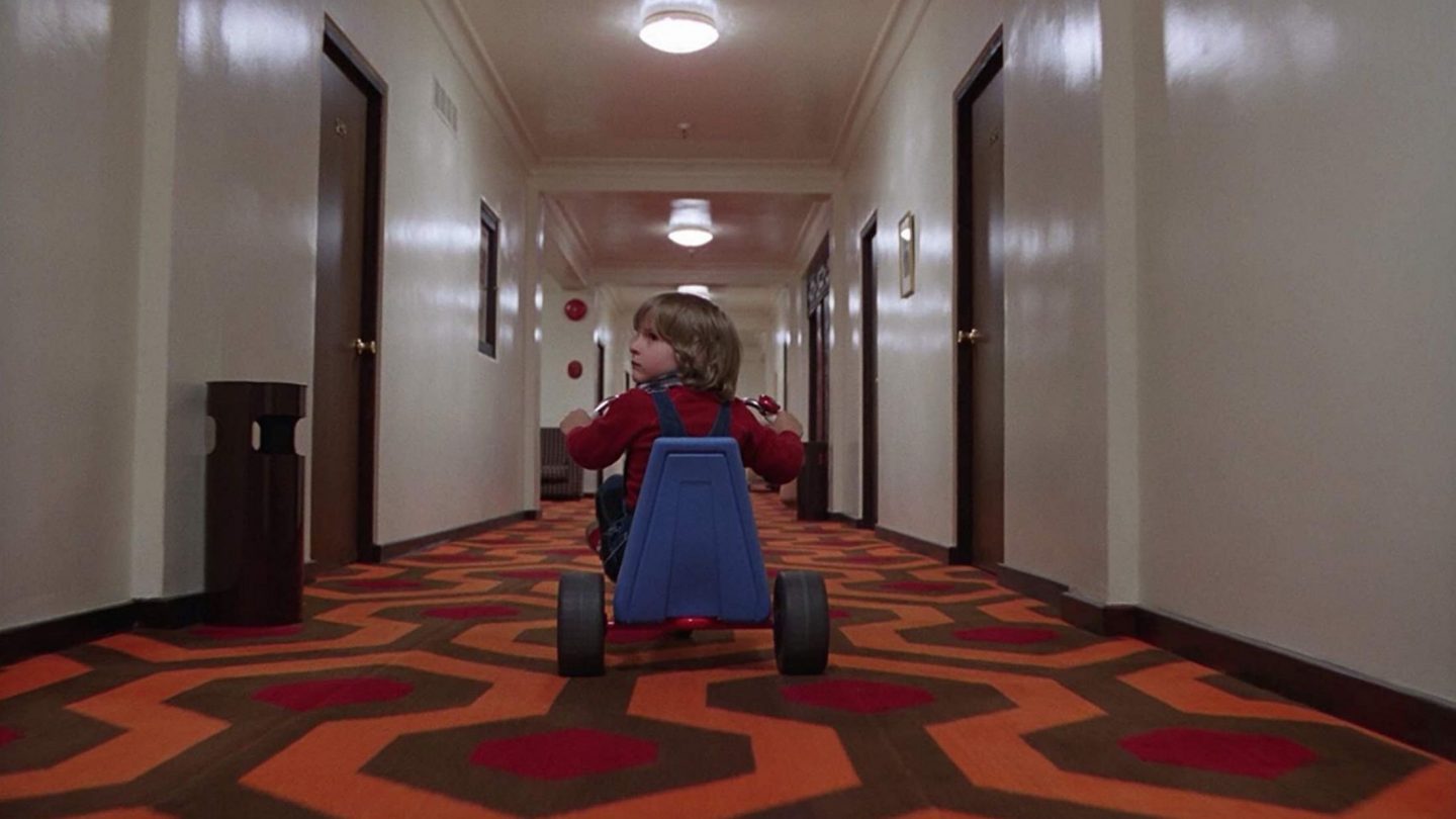
The Shining (1980)
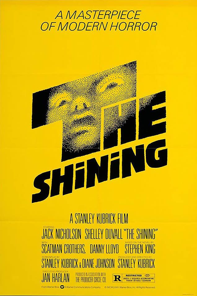
The Shining (1980) poster by Saul Bass.
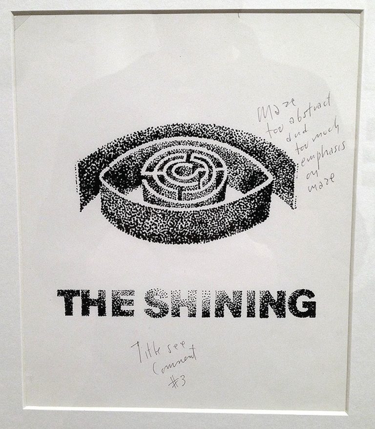
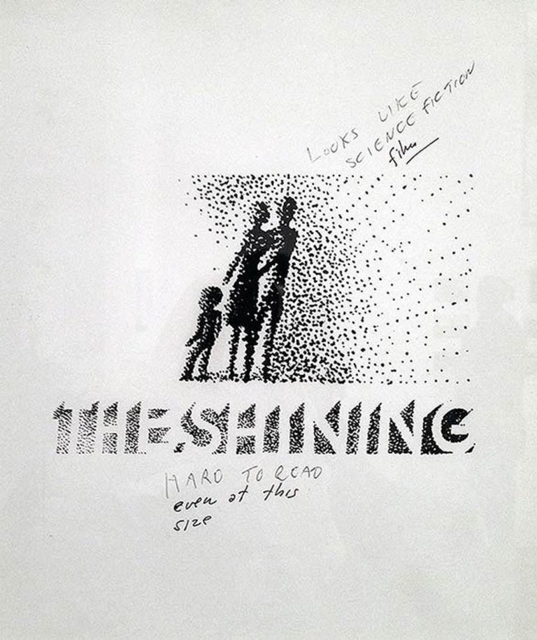
The initial designs for The Shining poster
“Known for his distinctive minimal style, legendary graphic designer Saul Bass revolutionised the role of title credits and film posters. But only Kubrick could prove that even the best-of-the-best still needed criticism, with Bass’s first round of initial sketches for The Shining poster rejected. “Hard to read, even at this size” scrawls Kubrick on one, “too irrelevant” and “not compact enough” he bemoans on the other designs. Kubrick’s harsh words proved a success, which created the iconic poster of the ghostly figure with harrowed eyes that still haunts viewers today.” Graphic Designer, Lottie

The Shining (1980) poster by Saul Bass.
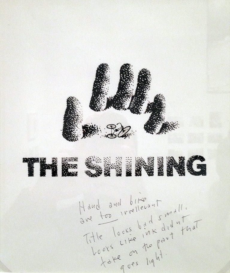
Initial sketches for The Shining (1980) poster by Saul Bass.
Stanley Kubrick: The Exhibition is on now at the Design Museum until September 2019. Book tickets here.
